
Case Study
Portughes
Rebranding
Logo, Van, Facades & Collateral

As my client was taking over Portughes from his father, he was also looking to create a fresh new brand for the company. This was his first business and he was still beginning to grasp what it takes to build up a brand.
I started him out by explaining what he should be looking for. We discussed the newest trends in design as well as the need to simplify aesthetics to the point that the customer could recognize the brand from a quick glance.
After advising him to keep the same color scheme from their previous branding, we decided on a deadline to show case various logo ideas. I rescheduled the rest of my work and focused my mind on this project.
I planned on a strategy moving forward, researched my clients competitors and worked along the latest design trends.


Presenting the logo


Presenting the logo to my client as a mockup for various stationery
As soon as we met the following week, my client instantly picked out this logo. I made sure to give him a few more options to choose from, ranging from different fonts, weights, textures and color gradient but he was more than happy to stick with the initial clean and simple design.
My client gave me his full trust and decided to let me take the lead. I was delighted he was pleased with everything I was presenting. Within a few more days of tweaking and multiple meetings with my client, the logo was finalized and ready to be used for printing and any other necessary media.

Portughes Facades redesign


Old and new designs of Portughes facades in Mriehel and Birkirkara
With the logo done, the next step was to meet up with my client again to measure the facades and discuss design.
At this point my client was willing to let me guide him through what I think would be best. With a few more days of work pressured with high expectations I showcased my designs on various mockups of their outlets. To my surprise he was ecstatic and didn't want any changes done, apart for some old photos and information they had on their previous design work.

Van Redesigns

Left side van redesign


Back
Front
Right side
With everything else taken care of, I had to face the biggest challenge of this project. I had never designed vehicle stickers before and was not familiar with the technicalities involved in printing them. Design wise it was a breeze and with some changing around of texts and colors, we quickly landed on our finalized design. With that out of the way, it was my job to figure out how to layout my work for print.
Luckily for me I came in contact with some very cool people working at Impressions Malta which were nice enough to walk me through the technicalities needed for them to print and apply to the vans.
Packaging & Business card
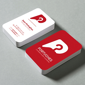
Business cards

Detergent packaging

Dry cleaned clothes packaging
This project was coming to an end and all that was left were some various designs meant to replace their old packaging and business cards. I made short work of these designs and handed over all the necessary files to my client.
While working solo on this rebranding project I acquired experience and insight I've never received before and surely helped me grow my confidence in tackling projects that require such intricate amount of work.